Saturday, 8 April 2017

Blue and ochre

I started an art journal this year, mainly to rediscover creating art and to do something with all the scrapbooking and stamping stuff that I did not touch in 2016...

Therefore, when I saw the layout Kate Yetter showed on the Paperartsy blog last week, I knew that two more pages would be filled in the art journal to join the Blue and ochre challenge.


I started by painting two pages with some blue Fresco paints, then covered it with gesso. Then I used the Urban Outsiders Stencil with Baltic Blue Fresco paint and coloured the inside with Haystack. These colours are also used with Crackle Glaze for the paper strips.


I used stamps from the Petals Plates 1, 3, and 6. The "Mother Nature" image on the right page is coloured with pencils. The "Secrets of the garden" text is a stamp from Lin Brown (ELB01).


Sunday, 26 March 2017

The future comes one day at a time

I made this card for the Doors, windows and architecture challenge on the Paperartsy blog.

I was impressed and inspired by Lin Brown's post on the PA blog. I did not create a whole book, but just stamped one image and coloured that with Derwent pencils.

It took some effort to create the background. I tried a lot of things. They all ended up in the garbage bin. In the end, I took a card, coloured it with white gesso and Haystack Fresco paint. The sentiment is stamped on paper coloured with Distress Ink.


Stamps used:
building: US-Arched Apertures Plate 1.
script: Travel Plate 2.
image, sentiment: Hot Pick 1007.

Sunday, 5 March 2017

The Craft Barn Blog Candy


The Craft Barn has some blog candy to give away: 12 new colours of Paperartsy Infusions. Hopefully, I can play with these soon!

You may find all details here.

Good luck!

Monday, 20 February 2017

Birds tag

I made this tag for the Masks challenge on the Paperartsy blog.

The background of this tag was coloured with Aged Mahogany and Dusty Concord Distress inks. On top of that I used a Tim Holtz mask and sprayed with Dylusions ink sprays. However, the effect was not yet good enough for me. I repositioned the mask, and painted with Butternut Fresco paint. This is the mask in the upper corner. For balance, I did the same in the lower left corner.

To finish the background, I stamped a leaf from ELB02 in white.

The birds are from chipboard and painted with Haystack, Zesty Zing, and some Autumn Fire Fresco paints. The little ribbon pieces in the bottom right corner again provide some balance.

I was inspired by the post by Ingrid Vichova on the PA blog, and wanted to create a lot of depth, like she did on her art journal page.


I hope you like it.

Monday, 30 January 2017

Pink and orange tag

I made this tag for the Pink and orange challenge on the Paperartsy blog.
Not the colours I use very often, so it took me some time before I knew what to create.

I used Butternut, Rusty Rose and a little Snow Flake Fresco paints for the sky. I created a scenery with stamps from Stampers Anonymous (car, branches and birds), and houses from Paperartsy HP1110.

To finish, I used a white pen for some details of the car and for some lights in the houses.


Monday, 16 January 2017

Practice Random Acts of Art

The second week of Wanderlust. This was about creating a lot of layers and a focal point. Layers may be completely covered by later layers. Actually, I do not like that. It is a pity of the work. Luckily, I took some photos, so that some layers are still visible.

I started with blue and purple colours.


Next, I added some scrap papers, including one with dutch text, and painted with green and brownish colours. There is not much left of the first layer. White paint for the focal point, a little off center to make it more interesting. No idea yet, what will be in the focal point.


This is the final page. I added blue colours again, and made the focal point yellow. To finish and make it my own creation I used some Paperartsy stamps. The old timer is a very old rubon. It neatly fits in the focal point, which was not foreseen! The leafs and flowers are drawn with Zig markers.


Sunday, 8 January 2017

Wanderlust 2017

Last year, I did not create anything, which was ok, lots of other things to do, lot of other things happened. However, at the end of last year, I returned to our craft room, and created an ATC. This was fun to do again.


I started this year with joining Wanderlust 2017, an online class that promises a year-long journey in art journaling and mixed media. The main reason is to get inspiration to use the stamps, inks, etc. again.

Therefore, my statement is Rediscover Happiness in Creating Art.


Monday, 25 January 2016

Heart tag

The second challenge at the Paperartsy blog is Hearts.

This tag is inspired by the example from Wendy Vecchi.

The heart is coloured with Zig Art & Graphics markers.
I embossed part of the tag with an embossing folder. I painted part of the tag with Honey Dew, first just a random area. Later on I changed it into another heart and drew a line around it with a black pen. I coloured the embossed diamonds with Lime Light fresco paint.

The cog is painted with beach hut.
The heart stamp is from EDY02, the sentiment is from Stampers Anonymous.

Sunday, 10 January 2016

Transparent Art

I have not played for a very long time. This year I decided to do more with all the crafting materials we have, and decided to follow the challenges on the Paperartsy blog. Every two weeks a new challenge seems an easy start, without too much rush.

The first challenge is Transparent Art.

For this challenge I searched for something transparent. I found a box with Memory Glass and some copper wire. I applied some Alcohol inks on the glass, but this may not be visible on the images. Then I glued it to a scrap of paper.

The background of the tag is painted with fresco paints (Snowflake, Ice blue, Sky, Old Gold).
The stamps are from HP1108 and Genetleman Plate 2.

I hope you like it.


Monday, 28 April 2014

3UP Challenge with Darcy stamps

When in March the next 3UP challenge was announced, I immediately sent an email to apply for the Eclectica {Darcy} stamps night. I was very surprised and pleased to be elected! So here is my project. The other projects can be found here.

I chose the EDY05 stamp sheet. I really like these stamps. They have so many details. All images in this project are from this stamp sheet. When I was colouring the images, every time another detail emerges that I had not yet seen.

For this project, I used a 8 by 8 inch canvas, that I painted with a mixture of Mushroom and Snowflake. Using Grunge Paste and the 'Mini Art Is' stencil (TCW261s), I stenciled some text onto the canvas. Next, I added more colours. I used Beach Hut, Lime Light, and Haystack with Chocolate Pudding to create a light brown colour. On the edges I used some darker colours, Hey Pesto and South Pacific. I painted some patches onto the canvas and then spread the colours out with a wet wipe. This creates a nice blended background.


I stamped the bird on a piece of smoothy card and coloured it with Derwent ColourSoft pencils. The frame is made from a piece of chipboard and is coloured with Brown Shed and French Roast.

The border is stamped in black and coloured with Hey Pesto, South Pacific, London Bus. The grass and the flowers are stamped with Pesto green and coloured with Hey Pesto, South Pacific, London Bus, and Zesty Zing.

Thursday, 20 February 2014

Create Art Every Day


This card was inspired by the cards Ellen Vargo made on the Paperartsy blog. But it turned out to be completely different!


I made a background using Haystack, Limelight, Brown Shed, and Autumn Fire fresco paints. I used some Claret on the corners. Then I stamped the leaves from the ELB02 sheet in Haystack. With black and white pens I outlined the leaves which makes them really pop!

The face and hat are stamps from Lost Coast Designs. The sentiment is an encouragement to myself to get out the paints and stamps every day, also after a busy day at work, LOL.

Wednesday, 22 January 2014

Bicycle Cards

These four cards are inspired by the Abstract Cards made by Ellen Vargo, who is this week's Guest Designer on the Paperartsy blog.


I pretty much followed the same steps. I coloured a sheet of A4 paper with a brayer and several Fresco's. Yes, there is some pink in it, Orchid! The other colours are Haystack, Beach Hut, South Pacific and London Night. On top of this, I applied Pewter, a Fresco Finish Metallic acrylic paint. This is the first time I used Pewter, and I really like the metallic effect!


Then I cut the paper into 4 pieces, and continued with stamping and creating more layers. I started with the cogs from Clocks 5 in Haystack. I applied Grunge Paste through a Mini Harlequin stencil and coloured it with Treasure Gold. To finish the background I stamped the ruler from Clocks 5 and the numbers from HP1108.

I stamped the motorcycle (HPXT05) and bicycles (stamp company unknown) on a piece of white paper, cut it, inked the borders with Little Black Dress, and glued them on the cards.


One of the cards in detail.


Monday, 20 January 2014

Brayered Tag

Art washes away from the soul the dust of every day life. The quote on this tag is one of my favourites. I try to get out the inks and paints every evening, even if is it for just half an hour. It really gets me detached from my work.

The tag is inspired by the tag Ellen Vargo made on the Paperartsy blog. I used the same techniques to create my tag.


The background is made by brayering several layers of yellow, green and blue Fresco's. I used Haystack, Lime Light, Guacamole, Hey Pesto, Beach Hut, and Baltic Blue. I also added some red accents with London Bus.

The yellow dots are made with a stamp from HP1004. I used the Dylusions Luscious Leaves stencil with Grunge Paste and some Treasure Gold.

Sunday, 19 January 2014

Art Journal Frontpage

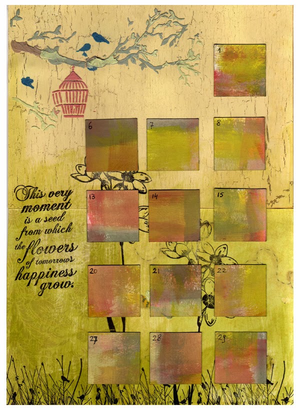
This is the front page of the Art Calendar I want to make for 2014. It will be quite a challenge to create a page for each month and to write down something for almost every day. Not all days at work are very interesting...


The base is chipboard. I wanted a crackled base with a dark crackles. Black would become too dark, so I chose London Night. When the Crackle Glaze was completely dry, I painted Vintage Lace and Ice Blue, and watched the crackles appear. I love this process!

The feather is made using the technique described here. The same technique was used by Julie Ann Lee on the Paperartsy blog.

The hand is from Cherry Pie Art Stamps. I coloured the pen with Chocolate Pudding and the hand with Nougat Fresco Finish paints.

To create the paper with the script I used the Blended Batik technique as described in Tim Holtz's Compendium of Curiosities book. First ink a piece of paper with a dark Distress Ink. Then stamp the script image with Distress Embossing Ink and apply clear embossing powder over it. Heat emboss the powder. Once dry and cooled, use a lighter Distress ink to ink over the paper and the script. Then comes the fun part. Place of piece of newspaper over the paper and iron over it on high heat. This will remelt the embossing powder and absorb it in the newspaper.

Sunday, 12 January 2014

Peacock feathers and a puppet

This week I created two little projects that were inspired by the Clare Lloyd on the Paperartsy blog: a puppet made with Squiggly Ink stamps, and an altered canvas.


For this little puppet I used Squiggly Ink Tops and Tails plate 6 and the heart from Eclectica Darcy 02. I coloured her with Hey Pesto, Claret, London Bus, Beach Hut and Vintage Lace for her face.


The background of this card was coloured with London Night. Then I applied Grunge Paste through the Mini Peacock Feathers stencil and coloured it with Beach Hut. I did not want to cover the Grunge Paste completely with the paint, the original Grunge Paste colour lightens up the card. The swirl stamp is stamped with Archival Jet Black.

Thursday, 2 January 2014

Textured Grunge Paste

Paperartsy's second Christmas Cracker video (here) shows more ways of using Grunge Paste. I tried the techniques on a chipboard coaster.


The picture of the steam locomotive is from Arty Collage Masculine Paper Art, a booklet with very masculine art images. I tinted the Grunge Paste with Nougat, Mushroom, and London Night. The Grunge Board numbers are coloured with Brown Shed.

This again was a fun technique to do!

Wednesday, 1 January 2014

Art Calendar 2014

A few days ago I went through some old Craft Stamper issues when I found an article about an Art Calendar by Kate Crane. Apart from a means to memorize all the important and not so important things, it also provides an album to group together all the little things I create. These cards, tags, etc. deserve a better place than lying somewhere on the desk.

So, I decided to start an Art Calendar for 2014. I had already made something that would now become the upper left corner of the january page.


The Sanded Foundations video, inspired me to get out the Grunge Paste, paints and stencils. In the large paper stash, I found a piece of paper with a crackled background. So easy, no need to do the crackling myself this time!

I applied the tinted Grunge Paste using the 'Mini Birds of a Feather' stencil. I used Guacamole, Toad Hall, and Chocolate Pudding for the branches and leaves. The birds are coloured with Baltic Blue. The cage is coloured with Brown Shed. All paints are Fresco Chalk Acrylics from Paperartsy.

Below is the first page for January.


Tuesday, 24 December 2013

Happy Christmas and Prosperous New Year

I would like to wish you all a happy Christmas, and a prosperous, healthy, and creative 2014 !


I was inspired by Jo Myhill's use of tissue paper on the Paperartsy blog. What would I create with this technique? It is nearly Christmas, so why not make a Christmas card? Actually, it is the only Christmas card I made this year...

I stamped some balls and holly from Paperartsy Noel plates 2 and 6 on a piece of tissue paper. Then I coloured the balls with Sky and Ice Blue. I coloured the holly with Toad Hall and London Bus, darkened with Little Black Dress. All this is done on the back of the tissue paper. When that was dry, I painted the back with Ice Blue mixed with Snow Flake to make a lighter shade.

I coloured a card with Sky, and stamped Mini MN39 using ColorBox MicaMagic Regal Red, to add some sparkle.

Using Satin Glaze I glued the tissue paper to the card.

The Happy New Year's wish is stamped with Archival Black. The sheet music is from Stampers Anonymous, stamped in Sepia. I coloured the background with Frayed Burlap and Scattered Straw Distress Inks. I distressed the border and coloured it with Vintage Photo.

Saturday, 7 December 2013

Vintage Archivist

Some time ago, I started a new project. The idea was to create a masculine / steampunk collage inside a wooden frame. I bought the frame, and started on the background. And then it just laid there on the desk. I had no idea how to continue.

This week some inspiration came. I cut 3 gothic arches from chipboard, and coloured them with Little Black Dress and Chocolate Pudding Fresco paints. I used Antique Linen Distress embossing powder and a swirl stamp to add some texture. The distress powder nicely matches a colour in the background. The man is an image from Google. The images in the left and right arches are from the Paperartsy HP1108 stamp sheet.


Next, I continued with the background. I applied Grunge Paste through the Mini Harlequins stencil. I also tried some rough texturing around the edges, but the peaks are not as high as I wanted. Not enough GP, or not given enough time to dry... As can be seen on the photo, I coloured the Grunge Paste first, with Old Gold. In an effort to create more peaks I added some more GP straight from the jar.


I coloured the area between harlequins with a Eggplant and Baltic Blue. Although it is quite dark, I like it, because it matches with other parts of the background. The harlequins themselves are coloured with Brown Shed, and then highlighted with Treasure Silver. This really makes them stand out!


This is the final piece. The label is made from a piece of metal. The word 'Archivist´ is from the same Paperartsy HP1108 stamp sheet.


Submitted for: Challenged by Alison Bomber on the Paperartsy blog.

Thursday, 31 October 2013

Shrink Plastic

Earlier this week Jo Myhill used Shrink Plastic in her project on the Paperartsy blog. I wanted to make something with shrink plastic as well. I am sure we have it, but where is it? After a long search in our large pile of stamping and scrapbooking supplies, I thought I found it. I coloured it, stamped an image on it, and started to heat it. Whatever I tried, so shrinking... Turned out, I had used acetate, it said plastic on the package ...

Long search again. Now I found it, it is called 'Krimpie Dinkie' in the Netherlands, and it even has a manual how to use it. (Yes, I read the manual). I painted it with Brown Shed fresco paint, stamped the image from HP1108, heated up the oven, and waited. Now it shrinked, which is always very nice to watch. This is the result. The colour turned out a bit dark. Next time, I use a lighter colour.


I painted the ATC with Sky Blue fresco paint, and then dry brushed Baltic Blue fresco paint on top. The upper right corner is made with Grunge Paste, the cogs stamp from Clocks 5, and Treasure Gold. The face and the text are also from the HP1108 sheet.