Showing posts with label 10x15cm. Show all posts

Thursday, 12 September 2013

Inspired by Alison Bomber

This week's guest designer on the Paperartsy blog is Alison Bomber. She started crafting only quite recently, but she has made some very nice creations.

I liked the weathered white crackle over a multi-coloured background, so I tried to recreate it. First, I made a background with Eggplant, Orchid and Baltic Blue. It looks really nice.


But when I crackled it with the Snowflake, actually nothing from the background was visible anymore... I sanded away some of the white to expose the background. No multi-colours, but still nice.

To finish the background, I applied London Night on the upper half of the card.

Next, I selected three stamps from the Ink and the Dog collection. The amazing birthday week at the Paperartsy blog inspired me to use those "old" stamps more often. I used Carte Postale from Words Plate 4, the doll from Dolls Plate 4, and the foot from Travel Plate 2.

I stamped the doll on white card and coloured her with South Pacific and Claret.

To give her something to stand on, I stenciled some pavement using the Luscious Leaves stencil from Dylusions with Grunge Paste mixed with a drop of Claret.


By selecting three stamps to work with, I create a kind of challenge for myself, mostly because the background must be made with other things or techniques. I had to do this in the 3UP challenge with the Lynne Perella stamps, and I really liked it!
Monday, 27 August 2012

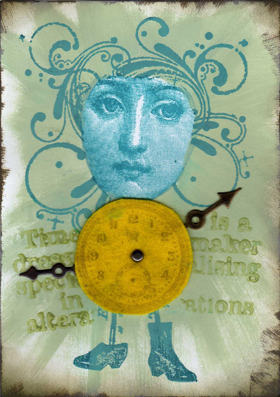
Take a Word - Clockwork


I created this card for this week's challenge at Take a Word which is CLOCKWORK. The face is a stamp from Lost Coast Designs that I stamped with Stazon ink. Then I coloured the card with Fresco Finish paint. The swirls around her face, her legs and shoes are coloured with Stream Adirondack ink. The clock is stamped on a piece of felt.

The text in the background is a Paperartsy stamp: Time is a dressmaker specialising in alterations. I stamped it with Hey Pesto, one of the new translucent Fresco Finish paints. When it dried, a shadow effect appeared around the text, which I like very much!

Monday, 6 August 2012

1927 Bicyclist


I joined an online workshop, called Composition for Collage, presented by Claudine Hellmuth. In four weeks she will show us some techniques for creating better compositions. This card I make as our homework for the first week.

The 1920s bicycles ad is from the course downloads. The man on the old bicycle is a stamp. All other elements are from a vintage dessin paper stack.

This card also fits for the MEMORIES challenge of Take a Word.

Monday, 16 July 2012

Take a Word - Moon


This weeks's theme at Take a Word is MOON. Searching google for some moon images, I came across an image with two cats in the moonlight. Now I knew what to create. The birds and the tree are Stampers Anonymous. The houses and the wall the cats are from PaperArtsy. The lady stamp is from Stempelbar. The cats is a Magenta stamp. I used Adirondack dye inks to colour the card.

Wednesday, 4 July 2012

Weather or not?


Until now, the summer in the Netherlands is not as good as we hoped for. Last year it rained a lot, and this year is not much better. A few days with high temperatures are often followed by heavy showers. Let´s hope the weather improves soon!

I made this card for this week´s Three Muses Challenge, which is called WEATHER OR NOT.

Monday, 2 July 2012

Take a word - Music


This week's theme at Take a Word is MUSIC. Not a difficult theme, but I could not decide what the main element would be for this card. Searching through my stash of embellishments, I found a lot of things that I have not used for a long time...
In the end, I chose a Memory Glass (Ideaology) and an image from Crafty Individuals. I painted the Memory Glass with alcohol inks, and wrapped it with Foil Tape (Ideaology).
The background is coloured with Fresco Finish Paints (PaperArtsy). The music score is a mask from Ideaology.

Monday, 25 June 2012

Take a Word - Insects


This week's theme at Take a Word is INSECTS. This is of my favourite themes!

The butterfly is stamped on a piece of fabric and coloured with Fresco Finish Paints. We learned this technique during the ArtsyCrafts event (see previous post). The card itself is very simple. A piece of design paper, some distress inks, and some PaperAtrsy stamps.

Monday, 21 May 2012

Take a Word - Dreams


This week's theme at Take a Word is DREAM. This card may picture some of Leonardo da Vinci's dreams, on the background of his well-known Vitruvian Man. To make him a little decent , I added some Foliage from Tim Holtz that I coloured with distress powders.

Het thema van deze week bij Take a Word is DREAM. Deze kaart toont een paar dromen die Leonardo da Vinci misschien wel gehad heeft. De achtergrond is zijn beroemde tekening van de man van Vitruvius, die ik iets fatsoenlijker gemaakt heb door wat Foliage van Tim Holtz toe te voegen .

Sunday, 29 April 2012

Take a Word - Black bird


This week's theme at Take a Word is BLACKBIRD. The birds on this card are not blackbirds, only black birds in a psychedelic landscape. The background is made with distress inks and stamps from Tim Holtz.

Het thema van deze week bij Take a Word is BLACKBIRD. De vogels op deze kaart zijn geen raven, maar wel zwarte vogels in een pscyhedelisch landschap. De achtergrond is gemaakt met distress inkten en stempels van Tim Holtz.

Monday, 23 April 2012

Take a Word - Numbers


This week's theme at Take a Word is NUMBERS. This is my entry.

Het thema van deze week bij Take a Word is NUMBERS. Dit is mijn bijdrage.

Monday, 16 April 2012

Take a Word - Time


This week's theme at Take a Word is TIME. Time to get out the Dali stamp sheet (Cherry Pie) with some unusual clocks. Time to get out the Tim Holtz book for the blended batik technique. The result is this card. All the colouring is done with distress inks. The sentiment and the background words are from Paperartsy.

Het thema van deze week bij Take a Word is TIME. Tijd voor het Dali stempelvel (Cherry Pie) met een aantal ongewone klokken. Tijd voor de blended batik techniek uit het boek van Tim Holtz. Het resultaat is deze kaart. Alles is gekleurd met distress inkt. De tekst en de woorden in de achtergrond zijn van Paperartsy.

Monday, 26 March 2012

Take a Word - Hats


This week's theme at Take a Word is HATS. A great opportunity to use my favourite stamp again: the gentlemen from Paperartsy.

Het thema van deze week bij Take a Word is HOEDEN. Voor deze kaart heb ik mijn favoriete stempel gebruikt, de gentlemen van Paperartsy.

Monday, 12 March 2012

Take a Word - Green


This week's theme at Take a Word is GREEN. The first thing that came to my mind is nature, so I decided to make a card with a lot of leaves. Searching through the stack of old scrapbook paper, I found a sheet with grass. This was perfect for the background. I cut two leaves from other scrapbook papers. With grungeboard letters I formed the word Nature. The letters are coloured with Fresco Finish paints.

Het thema van deze week bij Take a Word is GREEN. Het eerste waaraan ik dacht was natuur, het moest een kaart worden met veel bladeren. Toen ik de stapel scrapbook vellen doorzocht vond ik een oud vel met gras, perfect voor de achtergrond. Uit twee andere vellen heb ik bladeren geknipt. Met grungeboard letters heb ik het woord Nature gevormd. De letters heb ik geverfd met Fresco Finish Paints.

Monday, 27 February 2012

Take a Word - Mail


This week's theme at Take a Word is MAIL. We were asked to bring out our postmarks and stamps and use them in any way we liked. My stamps are made of rubber of course, and again all from Paperartsy. For the background I used paper from American Traditional Design. The Belgian stamp is from a Distressables sheet from Tim Holtz.

Het thema van deze week bij Take a Word is MAIL. Dit is mijn bijdrage. Als achtergrond heb ik papier van American Traditional Design gebruikt. De Belgische postzegel komt van een Distressables vel van Tim Holtz. Alle stempels zijn van Paperartsy.

Monday, 6 February 2012

Take a Word - Coffee


This week's theme at Take a Word is COFFEE. Coffee is my favourite drink! Since some years we have a coffee machine at home that automatically grinds the coffee beans and produces the best coffee. I also have several coffee-related stamps. I used them all on this card. The grinder and the bean bag are stamped with Versamark and embossed with clear powder, to resist the distress inks in the background. The sentiment is from the coffee bar that we weekly visit. The 5c are coloured with Glimmer Glam (Tattered Angels). The large swirl is from the stack.

Het thema van deze week bij Take a Word is KOFFIE. Ik drink veel koffie, zwart en sterk. Daarom hebben we sinds een paar jaar een espresso apparaat dat automatisch bonen maalt en koffie zet. Ik heb ook verschillende stempels die te maken hebben met koffie. Ik heb ze op deze kaart allemaal gebruikt. De maler en de zak bonen heb ik gestempeld met Versamark en embossed met clear poeder, hiermee krijg je een resist voor de distress inkt waarmee de achtergrond gekleurd is. De tekst zie ik wekelijks in onze favoriete koffie- en theewinkel. De 5c is gekleurd met Glimmer Glam van Tattered Angels. De grote swirl komt uit de stapel scrapbookspullen.

Monday, 16 January 2012

Take a Word - Fish


This week's theme at Take a Word is FISH. I made a scenery using stamps from stampscapes. The merman is an image that I found a long time ago on the internet.

Het thema van deze week Take a Word is FISH. Ik heb een scenery gemaakt met stempels van Stampscapes. De meerman heb ik ooit eens op internet gevonden.

Monday, 9 January 2012

Take a Word - Nature


This week's theme at Take a Word is NATURE. This is my entry. The man and the butterflies are stamps from Stampers Anonymous, coloured with Copics. The other stamps are from Paperartsy. The background is coloured with Adirondack inks using a stipple brush. I like the vintage result on matte paper. The fragments are coloured with alcohol inks.

Het thema van deze week Take a Word is NATURE. Dit is mijn bijdrage. De man en de vlinders zijn stempels van Stampers Anonymous, die ingekleurd zijn met Copics. De andere stempels zijn van Paperartsy. De achtergrond heb ik gemaakt met Adirondack inkt met een stipple brush. Dit geeft een mooi vintage effect op mat papier. De fragments heb ik gekleurd met alcohol inkt.